The Art of the Original Opening Sequence
How Wayne Fitzgerald Introduced The Bold and the Beautiful to the World
Everything begins somewhere. In television, few elements are more important than an opening sequence. It is the audience’s first impression, setting the mood, defining the visual identity, and inviting viewers into a new world.
The original opening sequence of The Bold and the Beautiful ultimately became every bit as bold, elegant, and luxurious as the series itself. In this article, we’ll explore what made it so different from most television openings of its era and why it has earned its place as a true classic.
Surprisingly, the story begins almost a century earlier.
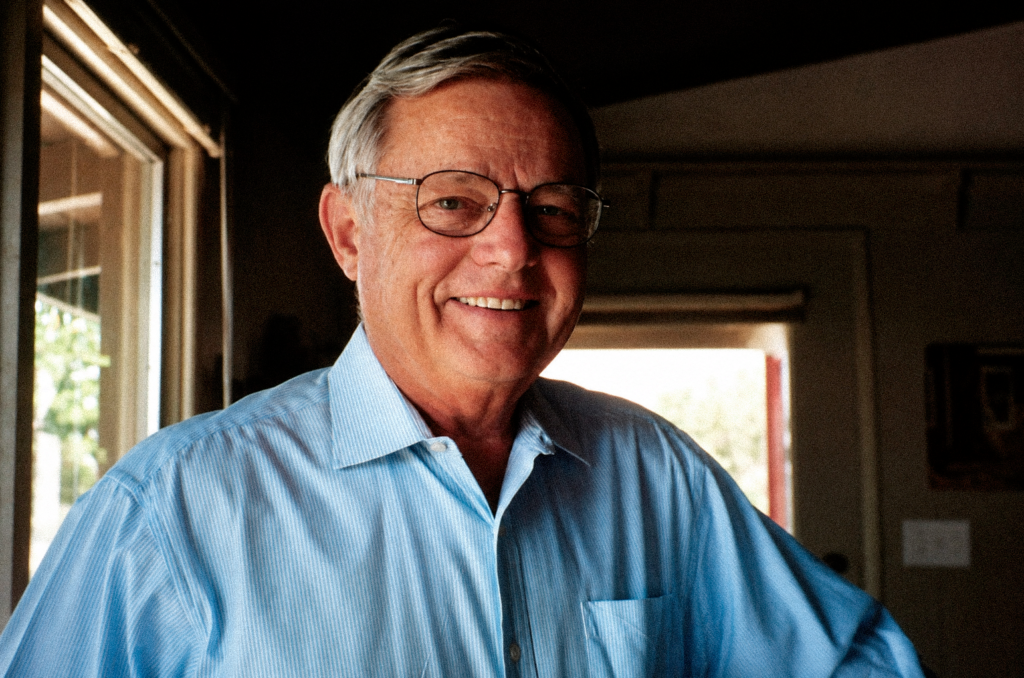
Walter Huxley (1926)
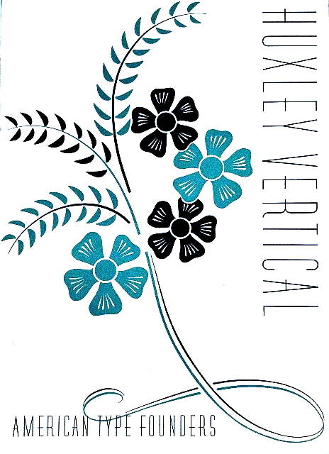
In the early 1930s, designer Walter Huxley created a typeface called Huxley Vertical (later released in various digital versions as Huxley Vertical BT Regular or Huxley Light Condensed). It was an exceptionally refined geometric sans serif that perfectly embodied the streamlined Art Deco aesthetic of its time.
Huxley was one of the principals of Huxley House, a Manhattan-based design and printing firm. He developed the typeface for American Type Founders (ATF), which officially released it in 1935.
Huxley Vertical reflected the growing fascination with streamlined Art Deco design that defined the 1930s. The style dominated architecture, advertising, transportation, and industrial design throughout the decade. It reached its peak at the 1939 New York World’s Fair, where more than 30,000 visitors each day experienced Futurama, the famous exhibition that envisioned a sleek, streamlined future.
Inspired by this design movement, Huxley created a typeface unlike anything else available at the time. Yet despite its originality, it failed to find commercial success. Sales were so disappointing that ATF did not even include it in the company’s type catalogs during the 1940s.
At the time, American Type Founders was the dominant force in American typography and type manufacturing. Throughout the late nineteenth and first half of the twentieth century, its influence on graphic design was enormous. If ATF considered a typeface unsuccessful, its chances of finding a wider audience were extremely slim.
Huxley Vertical AD Poster (1935, ATF)
Following Walter Huxley’s death, ATF made one final attempt to revive the typeface in 1955.
Unfortunately, the effort was surprisingly uninspired.
The company barely explained or demonstrated the alternate letterforms that had been one of Huxley’s most distinctive ideas. Instead, Huxley Vertical was marketed alongside the streamlined industrial styling that had become fashionable in American consumer products of the 1950s, particularly kitchen appliances.
The campaign failed to generate much interest, and once again the typeface disappeared into obscurity.
For the next thirty years, Huxley Vertical was largely forgotten.
More than fifty years later, the forgotten typeface finally found the role it had been waiting for.
In 1987, William J. Bell set out to create a new CBS daytime drama centered on wealth, power, ambition, romance, and the glamorous world of high fashion. The series would become The Bold and the Beautiful. To design its opening titles, Bell turned to one of the industry’s true masters: Wayne Fitzgerald.
Wayne Fitzgerald (1987)
For The Bold and the Beautiful, Fitzgerald envisioned an elegant concept that captured the world behind the scenes of high fashion. Flowing fabrics, fashion models, camera flashes, sweeping views of Los Angeles, and glamorous portraits of the cast, presented as if they were part of an editorial fashion shoot, all reflected his distinctive creative vision.
For the series logo and title design, Fitzgerald revived Walter Huxley’s long-forgotten Huxley Vertical typeface, transforming it into one of television’s most recognizable title treatments. The unforgettable main theme was composed by Jack Allocco and David Kurtz, while Fitzgerald edited every image to match the rhythm, energy, and emotion of the music, creating a seamless fusion of sound and picture.
The elegant typography, the signature palette of black, white, and soft pink, and the graceful animation of the title synchronized with Allocco and Kurtz’s vibrant score became the defining visual identity of The Bold and the Beautiful. It was an extraordinary achievement, and in 1988 Fitzgerald was honored with the Daytime Emmy Award for Outstanding Achievement in Graphic and Title Design for his work on the CBS daytime drama.
Now, let’s take a closer look at the original 1987 opening sequence, frame by frame, and explore why it remains one of the finest title sequences ever created for television.
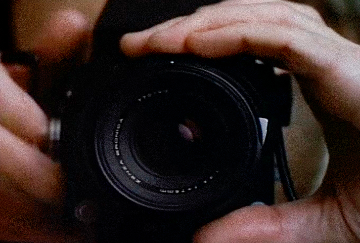
Frame 1 - The Camera
The Camera
We never see the photographer. We see only the lens.
In the late 1980s, a professional camera represented far more than a piece of equipment. It symbolized creativity, prestige, advertising, fashion, and the glossy world of luxury magazines. Today, the opening shot of a television series might feature a smartphone. In 1987, however, a camera immediately signaled something very different: this was the world of professionals, image-makers, and high fashion.
For a series centered around a fashion house, it is difficult to imagine a more fitting opening image.
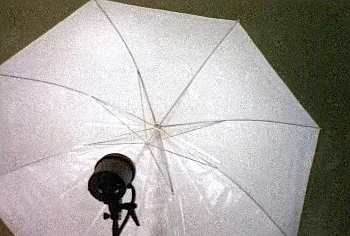
Frame 2 - The Umbrella
The Umbrella
This is where the real magic begins.
Most viewers glance at this shot and think, “It’s just studio lighting.”
It isn’t.
It is a symbol.
Before introducing a single model or cast member, the opening sequence reveals the machinery behind beauty itself. Fitzgerald isn’t showing us the finished illusion. He’s showing us how the illusion is created.
That idea lies at the very heart of The Bold and the Beautiful. Long before glamour reaches the runway, it begins behind the camera, beneath the lights, among fabrics, photographers, stylists, and designers. Beauty is not presented as something effortless. It is carefully crafted.
Ironically, this perfectly echoes the series’ original working title, Rags, a reminder that before there is glamour, there is fabric.
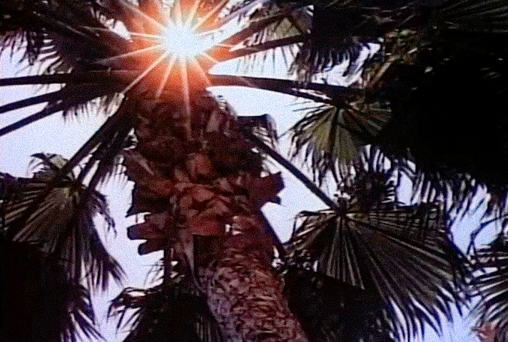
Frames 3-5 - Los Angeles
Los Angeles
With the fashion studio established, Fitzgerald immediately shifts to the city itself.
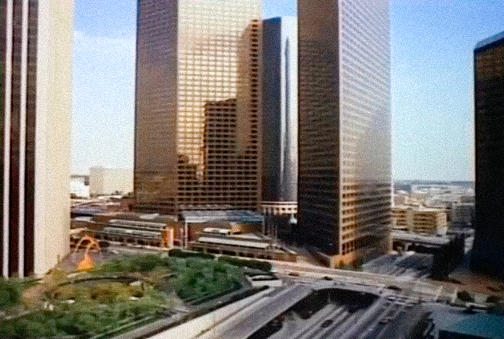
Sunlit palm trees are followed by some of downtown Los Angeles’ most recognizable landmarks: Union Bank Plaza, Wells Fargo Tower, The Westin Bonaventure Hotel, and KPMG Tower (then known as Wells Fargo Tower II).
These shots do far more than establish the setting.
They introduce the visual identity of the series.
The soaring skyscrapers, reflective glass façades, sharp geometric lines, and unmistakable California sunshine project everything the show wants to become: modern, sophisticated, ambitious, and unapologetically glamorous.
This is not the Los Angeles of beaches and Hollywood Boulevard. It is the Los Angeles of corporate power, luxury, and success, a city where fashion is business and beauty is an industry.
Before a single character appears on screen, Fitzgerald has already told the audience exactly what kind of world they are about to enter.
Frames 6-9 - The Models
The Models
The first fashion models finally appear.
Yet Fitzgerald never presents them as complete figures.
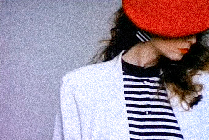
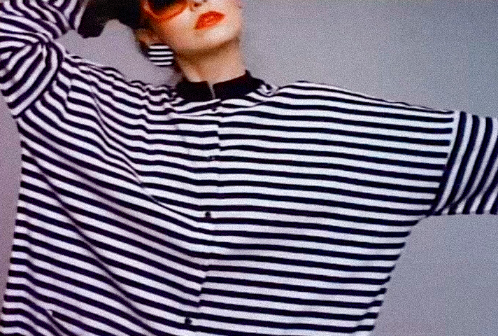
Their faces are partially hidden. Their bodies are cropped. Shoulders disappear beyond the frame. Arms merge into fabric. Waists are barely visible. The viewer is never given a full look at a single outfit.
This is a deliberate artistic choice.
Rather than documenting fashion, Fitzgerald abstracts it.
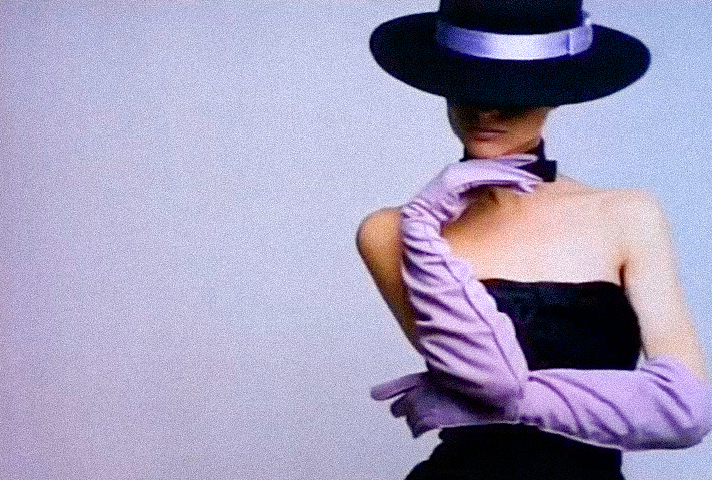
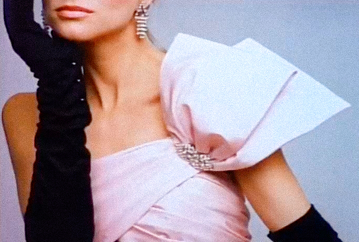
The human figure dissolves into a composition of lines, shapes, textures, and color. A striped blouse becomes a graphic pattern. A wide-brimmed hat transforms into a bold geometric silhouette. Flowing gloves, sculptural shoulders, and carefully posed hands become visual elements in their own right.
The result feels closer to an Art Deco illustration or an editorial from a high-fashion magazine than to traditional television photography.
These are not simply beautiful women wearing elegant clothes.
They are living design.
Frames 10-12 - The Title
The Title
These three shots may be the most important in the entire opening sequence. Ironically, they are also the ones most viewers barely notice.
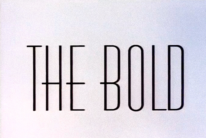
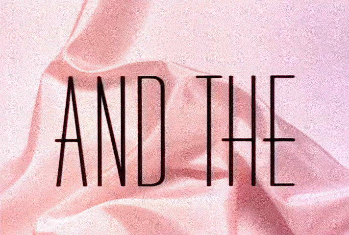
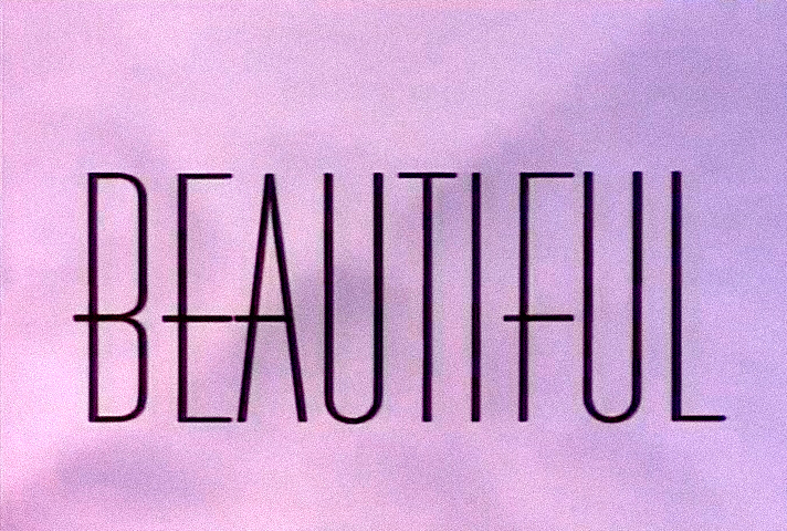
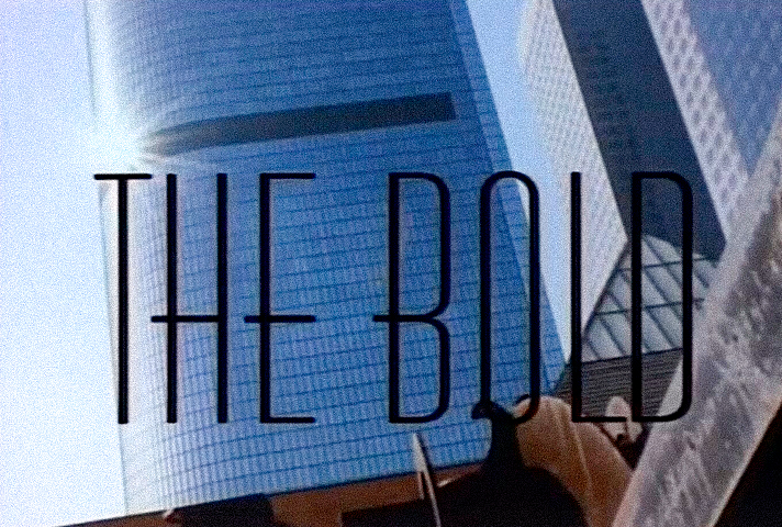
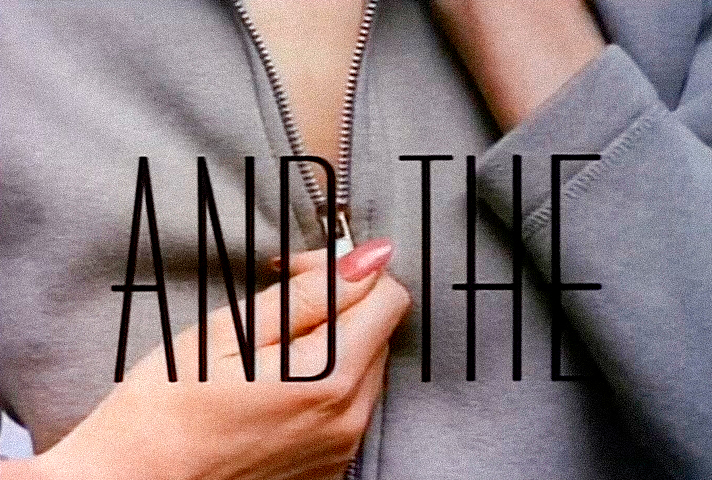
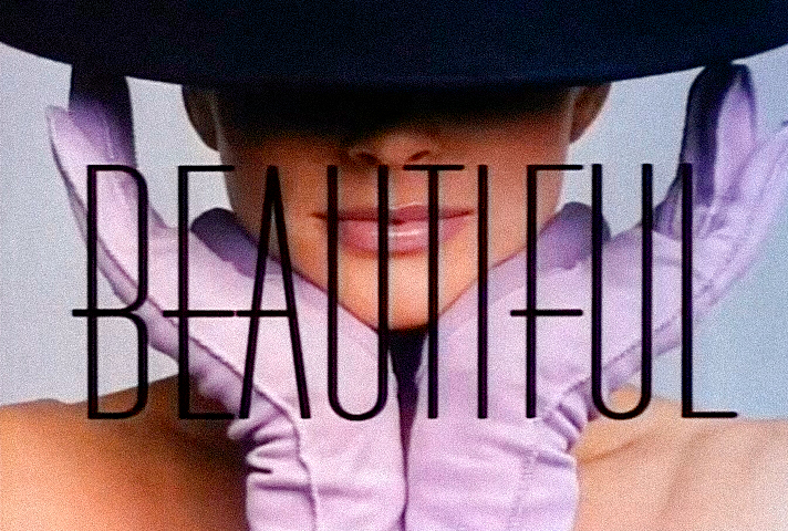
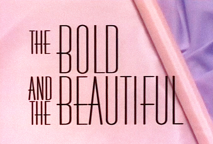
The title appears in three separate stages: THE BOLD AND THE BEAUTIFUL.
At first glance, the words simply appear against different colored backgrounds.
But look more closely.
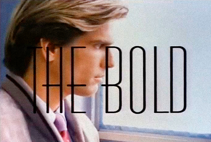
THE BOLD is set against what appears to be plain white cotton or muslin, the kind of fabric traditionally used to create a garment’s first prototype.
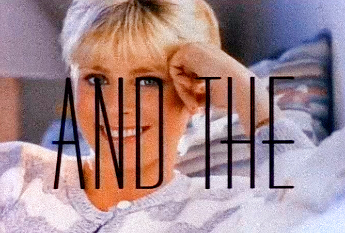
Next comes AND THE, now placed over soft pink silk, suggesting the stage where the design begins to take shape in its intended fabric.
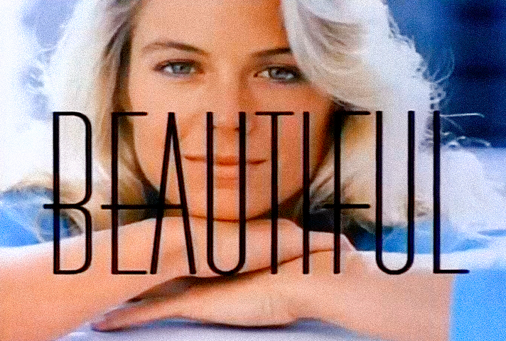
Finally, BEAUTIFUL appears over delicate translucent organza, evoking the final touches of couture: elegance, refinement, embellishment, and finish.
Whether this progression was an intentional visual metaphor or simply a remarkably elegant design choice, it perfectly mirrors the journey of haute couture itself, from concept to finished masterpiece.
And then there is the typeface. The very same typeface that began this story. A design created more than fifty years earlier, dismissed by its own era, is reborn in the hands of Wayne Fitzgerald. What had once been considered commercially unsuccessful suddenly became timeless, sophisticated, and unmistakably modern.
It is an extraordinary example of how great design sometimes needs nothing more than the right moment and the right visionary to reveal its true potential.
Bravo, Wayne Fitzgerald!
Frame 13 - The Skyline
The Skyline
The pace slows for a brief moment.
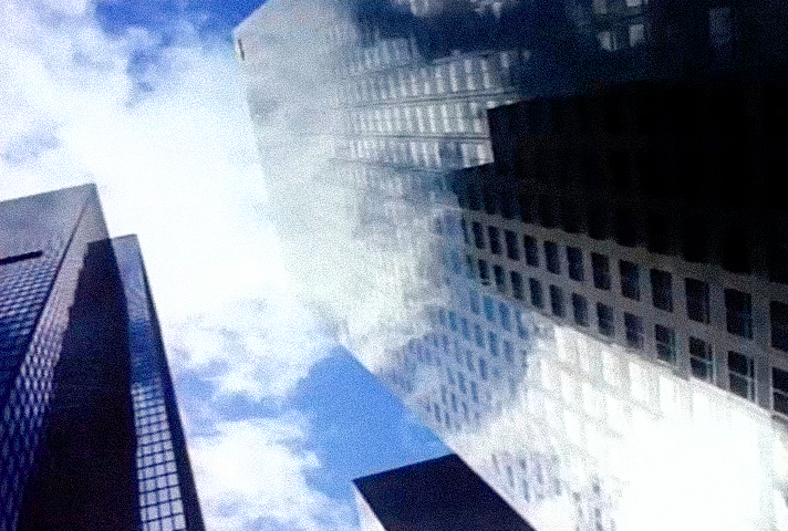
Once again, Fitzgerald returns to the cool geometry of downtown Los Angeles. Towering skyscrapers stretch toward an endless sky as drifting clouds are mirrored in their glass facades.
It is a striking contrast. Sky and concrete. Nature and architecture. Soft forms reflected in rigid geometry.
Whether intentional or not, the image quietly echoes one of fashion’s enduring tensions: the constant dialogue between the organic and the engineered, between natural beauty and human design.
Even this transitional shot feels carefully composed. It isn’t merely an establishing image of the city. It serves as a visual pause, allowing the audience to breathe before the opening sequence moves into its next movement.
Frames 14-18 - The Forresters
The opening sequence now shifts from introducing a world to introducing a family.
And Fitzgerald does so in a way that feels remarkably different from modern television. These are not merely cast portraits. Each image quietly tells us who these people are before they speak a single line.
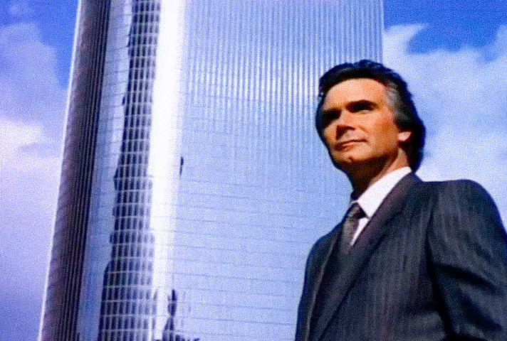
Eric Forrester (John McCook)
Eric is filmed from a low angle, one of cinema’s oldest visual techniques for conveying authority.
The camera seems to say that this man stands above everyone else, not physically, but socially. He is the founder, the visionary, the man who built the empire.
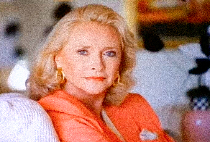
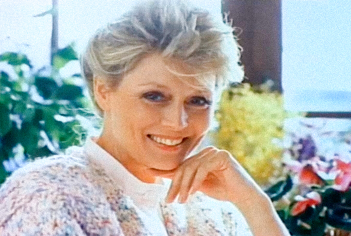
Stephanie Forrester (Susan Flannery)
Stephanie does almost nothing. She simply sits and looks toward the camera. Yet the effect is extraordinary.
Without a word or a gesture, she radiates control. The image suggests that this is the woman who truly governs the household. Power does not always need movement. Sometimes it only needs presence.
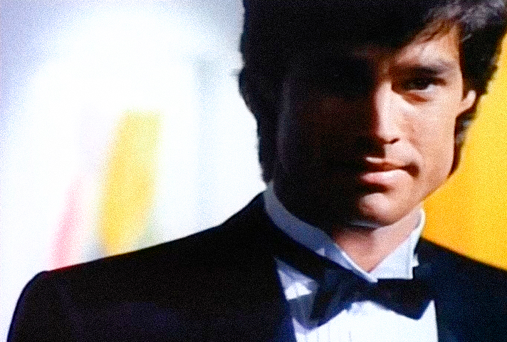
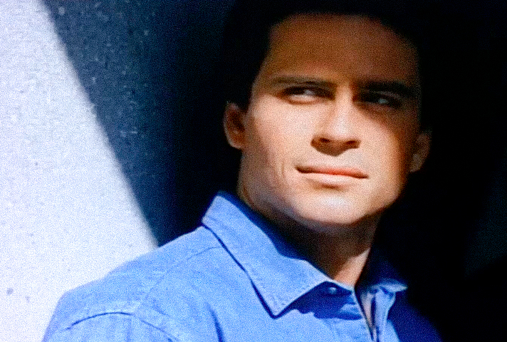
Ridge Forrester (Ronn Moss)
Light divides Ridge’s face almost perfectly in half. Whether intentional or not, the symbolism is difficult to ignore. Light and shadow. Charm and mystery.
The romantic hero who is handsome enough to attract admiration, yet enigmatic enough to remain unpredictable. Mystery has always been one of drama’s most powerful selling points. Combined with Ronn Moss’s striking screen presence, the result is unforgettable.
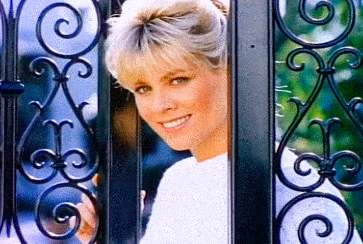
Kristen Forrester (Teri Ann Linn)
Kristen becomes the first member of the family to offer a genuinely warm smile.
She is framed in the gates of the Forrester estate, a subtle visual choice that may hint at her unique place within the family. Unlike the others, she immediately appears more approachable and emotionally open.
Looking back with the benefit of hindsight, the image feels almost prophetic, foreshadowing the return of the family’s prodigal daughter to her childhood home.
Thorne Forrester (Clayton Norcross)
Thorne is the only Forrester introduced while working inside Forrester Creations. This choice feels significant. Rather than emphasizing wealth or status, the image emphasizes effort.
It can be read as an early suggestion that Thorne is the son who must earn his place within the family business through dedication and hard work, forever striving to prove himself worthy alongside his older brother and heir to the empire.
But these shots are more than individual character introductions. Together, they form something resembling a family tree.
First comes the world. Then its founder. Then the matriarch. Then the heir. Then the next generation. Not simply a cast… The Family… A dynasty.
Frames 19-22 - The Logans
Until this point, Fitzgerald has been carefully constructing the world of the Forresters. Then, almost without warning, everything changes. Not just the characters.
The entire visual language changes.
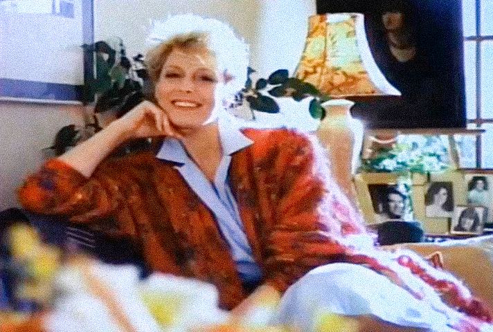
Beth Logan (Judith Baldwin)
Gone are the imposing office towers and carefully controlled portraits.
Beth is introduced in a warm, sunlit home filled with soft colors and natural light. There is no sense of corporate authority or social status. Fitzgerald distinguishes the two families within seconds, using imagery rather than dialogue.
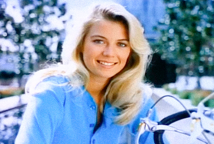
Brooke Logan (Katherine Kelly Lang)
This is where a television legend is born. Everything about Brooke’s introduction tells us that she belongs to an ordinary world. Her bicycle. Her casual blue blouse. Her loose hair. Nothing about the image suggests wealth or privilege.
Looking back, the shot feels almost prophetic. Fitzgerald quietly plants the seed of what will become the series’ defining fairy tale: the young woman from the Valley whose life will become forever intertwined with the powerful Forrester dynasty.
Storm Logan (Ethan Wayne)
Storm is photographed in a way that subtly echoes Ridge’s introduction. But there is one crucial difference. Ridge stands in dramatic light. Storm remains in shadow.
The effect makes him feel less glamorous and far more grounded. He appears as someone shaped not by privilege, but by responsibility, the older brother carrying the weight of a family without a father.
Donna Logan (Carrie Mitchum)
Donna’s portrait is wonderfully uncomplicated.
The beach. Friends. Laughter. Youth. Sunshine. It is an image of innocence, optimism, and carefree happiness.
Taken together, these introductions reveal Fitzgerald’s greatest achievement. He does not simply distinguish two families. He creates two entirely different worlds.
The Forresters inhabit a universe of business, power, architecture, and carefully controlled elegance. The Logans live in a world of warmth, family, sunlight, beaches, and everyday happiness. One family has built an empire. The other has built a home.
And it is precisely the collision of these two worlds that becomes the driving force of The Bold and the Beautiful.
Frames 23-25 - The Title Returns
The Title
The three defining words appear once again. THE BOLD AND THE BEAUTIFUL. But this time, they carry new meaning.
THE BOLD
The word BOLD does not float against an abstract background.
It is placed directly over the skyline of downtown Los Angeles, visually anchored to one of the city’s modern skyscrapers.
The effect is subtle but powerful. Boldness is no longer just a personality trait. It becomes an architectural statement.
The buildings surrounding the title, including One California Plaza and the Museum of Contemporary Art (MOCA), represented some of the most ambitious architectural thinking of their era. Designed by architects such as Arthur Erickson and Arata Isozaki, they embodied innovation, experimentation, and confidence.
The visual connection is striking. Boldness belongs not only to fashion designers, but to architects, artists, and creators of every kind.
AND THE
The second title card abandons flowing fabric altogether. Instead, Fitzgerald places the words over the close-up of a zipper. A remarkably simple image. And a remarkably clever one. A zipper is not decoration. It is construction. It is the moment when separate pieces become a single garment. Even the smallest element of clothing becomes worthy of attention.
In Fitzgerald’s visual language, fashion is never just about the finished dress. It is about craftsmanship.
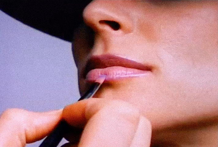
BEAUTIFUL
The final word receives perhaps the most elegant image of all. Fitzgerald does not show the model’s face. Her eyes remain hidden beneath a wide-brimmed hat. Instead, our attention is drawn to her lips, the sculptural hat, and the dramatic lavender gloves framing her face. Beauty, the sequence quietly suggests, does not depend on revealing everything. Mystery can be just as beautiful as perfection.
In the world of haute couture, beauty has never been defined solely by a face. It emerges through silhouette, proportion, texture, movement, and suggestion.
The model is no longer simply a person. She becomes the embodiment of style itself.
Frame 26 - Eric Forrester
Eric Forrester (John McCook)
Eric returns.
But the mood has changed completely.
His first portrait placed him against open sky, modern architecture, and daylight, presenting him as the confident founder of a successful empire.
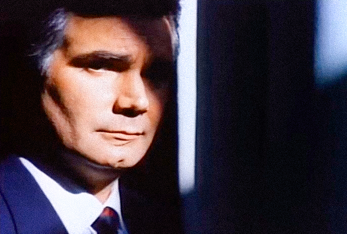
Now, Fitzgerald reveals another side of the same man. Darkness dominates the frame. A sharp vertical shadow cuts across his face. The composition borders on film noir. This is no longer simply the patriarch of the family. This is a man with history. A man carrying burdens. A man whose authority has come at a price.
Without a single word, Fitzgerald transforms Eric from a symbol of success into a fully dimensional character.
Frames 27-30 - The Spencers
The third and final family now enters the opening sequence. This is where Fitzgerald makes one of his most subtle storytelling choices. Until this point, the visual language has been clearly divided.
The Forresters represent power. The Logans represent warmth. Then the Spencers arrive. And they belong to neither world.
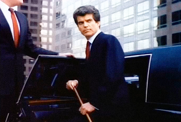
Bill Spencer (Jim Storm)
Bill’s introduction is impossible to mistake. He doesn’t simply appear. He arrives.
Stepping out of a limousine, he is framed using one of cinema’s oldest visual conventions. Characters who emerge from a car are rarely ordinary people. They are people whose arrival changes the room before they even speak.
It is an image of influence. Of status. Of someone accustomed to being noticed.
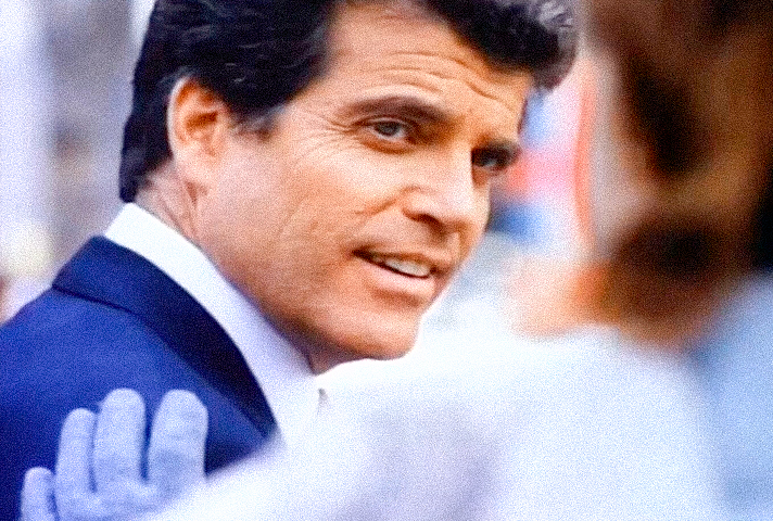
Bill’s second shot immediately softens that impression. He turns. He smiles. He speaks to someone just outside the frame. Unlike the almost sculptural stillness of the Forresters, Bill suddenly feels approachable and alive. His authority remains. But now it possesses warmth, charm, and charisma.
Power no longer appears distant. It becomes personal.
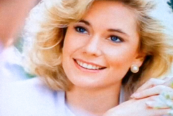
Caroline Spencer (Joanna Johnson)
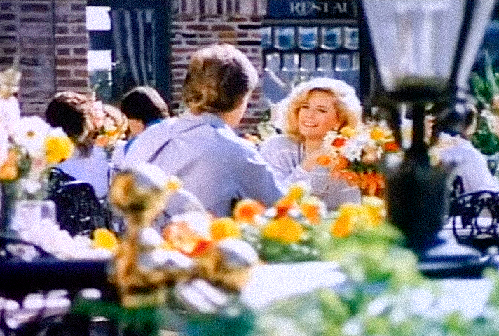
Caroline’s first appearance is beautifully understated. Most viewers simply see a young woman sitting at an outdoor café. But Fitzgerald frames her through flowers, foreground details, and surrounding space, creating an unusually intimate composition.
Rather than placing Caroline on display, the camera invites us to observe her quietly from a respectful distance. The effect makes her feel refined, elegant, and somehow just beyond reach. Almost like royalty within the city’s social elite.
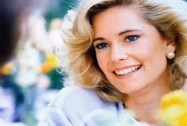
Her second portrait moves much closer. The setting remains unchanged. Only the distance changes. Caroline smiles directly toward the viewer. It is one of the warmest smiles in the entire opening sequence.
Together with Bill’s earlier smile, it subtly defines the Spencer family. They possess wealth and influence. Yet they also possess humanity.
This is Fitzgerald’s brilliance. He never needs title cards explaining who these people are. He never tells us who is rich, who is middle class, or who belongs to the city’s elite. He lets the environments speak for themselves.
The Forresters create beauty.
The Logans live naturally within it.
The Spencers inhabit the world where beauty, influence, and social status intersect.
Frames 31-33 - Another Side of Los Angeles
The next three portraits reveal another side of the city, another way of life, and another kind of character. The glamour begins to fall away…
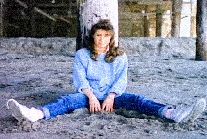
Katie Logan (Nancy Sloan)
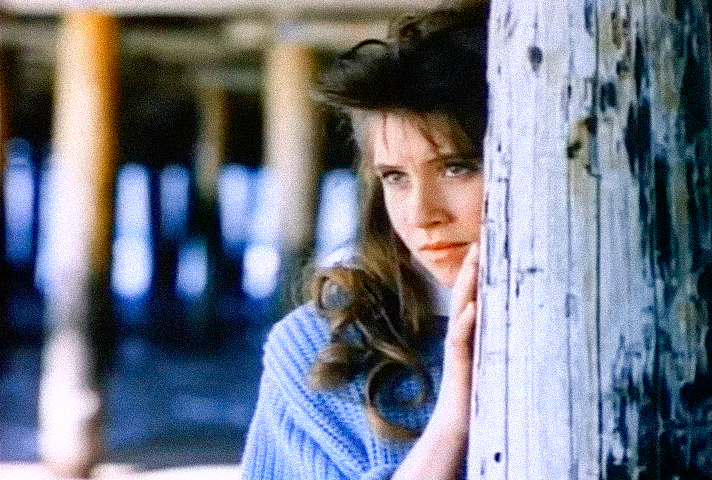
There is something almost expectant about this image. Katie is watching. But not from a window. Not from the safety of her home. She peers from behind one of the wooden pilings of a pier. It is an unusual choice of setting, and a strangely poetic one.
The pier evokes youth, solitude, and dreams of something beyond the horizon. It could hardly be further removed from the glass towers and polished surfaces that defined the Forrester world earlier in the sequence. Once again, Fitzgerald creates contrast through environment. Katie belongs to a different Los Angeles.
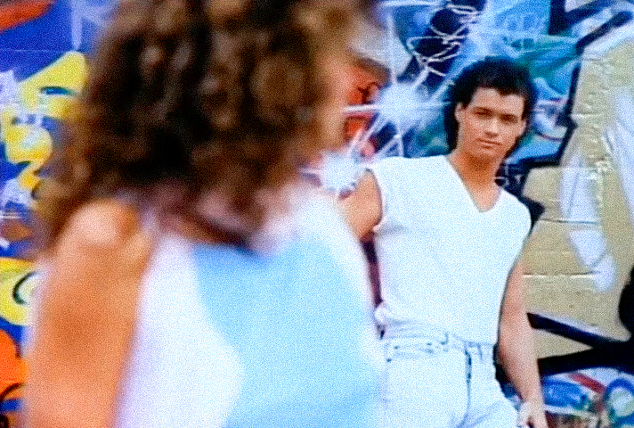
Rocco Carner (Bryan Genesse)
And suddenly, the entire mood changes. Graffiti. Concrete. Street culture. Energy. Freedom.
Rocco brings yet another Los Angeles into the opening sequence. Not corporate. Not glamorous. Not domestic. Alive. Raw. Real.
Even his composition reinforces the idea. Rocco isn’t presented formally to the camera. He stands in the background, watching someone in the foreground, as though Fitzgerald has captured a moment from life rather than arranged a portrait.
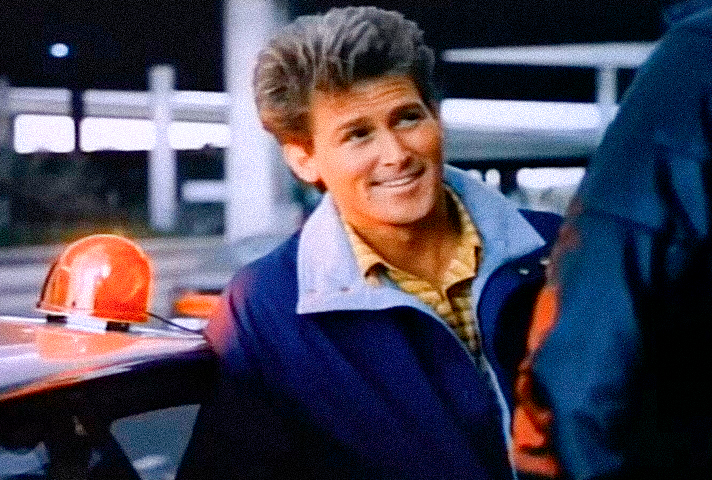
Dave Reed (Stephen Shortridge)
Dave continues the visual language introduced with Rocco.
Again, we are outside. Again, we are in the everyday city. This time there is a police car, a uniform, an emergency light, and the casual movement of people going about their lives.
The glamour is gone. No fashion shoot. No mansion. No limousine. No skyscraper towering overhead.
Just Los Angeles. And life.
Frames 34-35 - Margo Lynley
Once again, Fitzgerald shifts the tone. The glamour returns. So does the world of fashion.
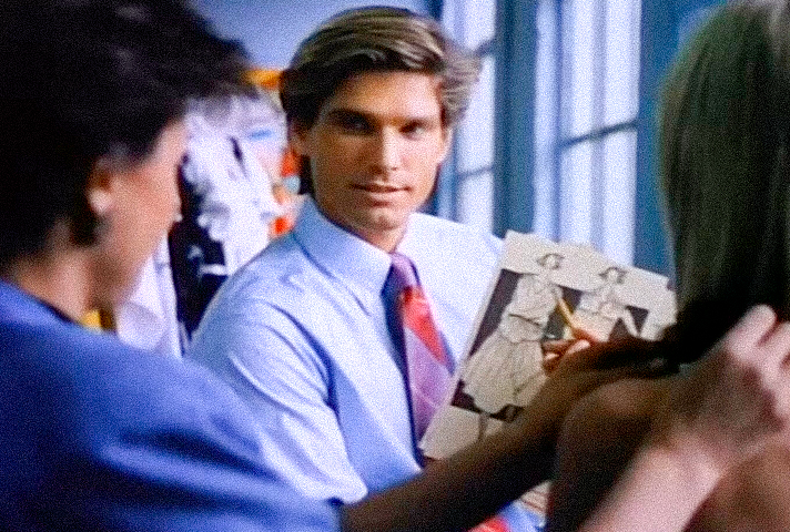
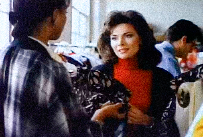
Margo is the only woman in the opening sequence introduced while actively working. That detail matters. She is not simply being admired. She is participating.
Margo Lynley (Lauren Koslow)
Surrounded by garments and colleagues, she is presented as a professional, someone whose place in this world is defined by talent as much as appearance.
It is a remarkably modern image for a television opening in 1987.
The second shot moves in for a close-up. The setting disappears. Only Margo remains. Her expression is calm, focused, and thoughtful.
Fitzgerald presents something rarely emphasized in television title sequences of the era. Beauty and intelligence coexist effortlessly. Margo is not portrayed as a decorative figure. She is portrayed as a woman whose confidence comes from who she is, not merely how she looks.
Frames 36-38 - The Title Returns Again
The Title
Once again, the three defining words appear.
THE BOLD AND THE BEAUTIFUL.
This time, however, they no longer stand alone. They are woven directly into portraits of Thorne, Kristen, and Brooke. By now, the meaning of the title no longer needs explaining.
Fitzgerald has already introduced the city. The fashion world. The great families. Their values. Their contrasts. The words have become more than a title. They have become a statement.
These are The Bold.
These are The Beautiful.
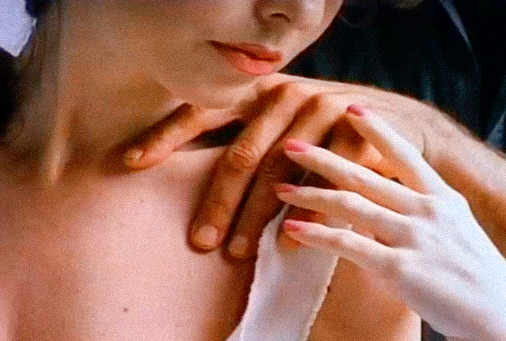
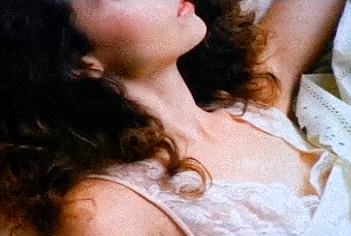
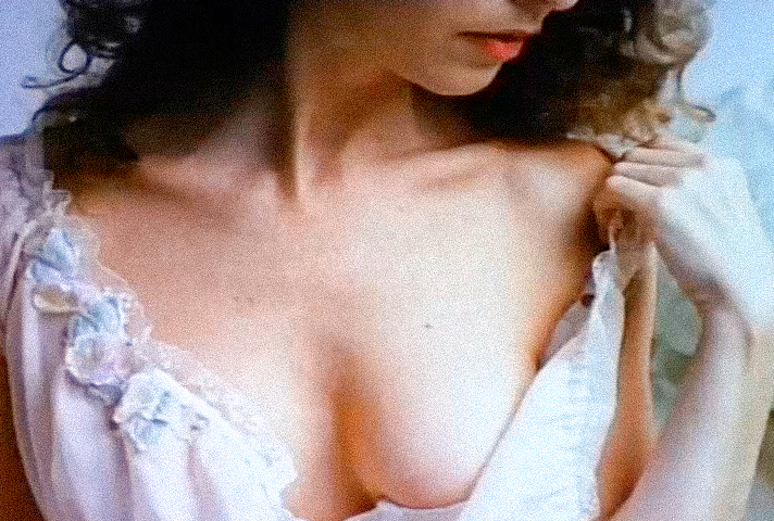
Frame 39 - The Model
The Model
Another visual pause. No characters. No dialogue. No story. Only the language of haute couture.
The composition feels strikingly reminiscent of late-1980s advertising.
Sensuality is conveyed not through revelation, but through suggestion. A bare shoulder. A gentle touch. Soft light. Nothing is explicit. Everything is implied. This is elegance rather than provocation.
Fitzgerald understands that true glamour has never depended on showing everything. Mystery is often far more seductive than exposure.
For a brief moment, the opening sequence stops telling its story and simply allows the audience to experience the atmosphere of the world it has created.
Frames 40-42 - Returning to the Characters
Let’s return to the characters, but from an another view. The opening sequence now revisits several familiar faces. Not to repeat them. But to reveal them from a different perspective.
Katie Logan (Nancy Sloan)
Katie is still beneath the pier. But the composition has changed. The camera has pulled back. For the first time, we truly notice the space surrounding her. Katie herself almost becomes secondary to the vastness of the environment. The towering wooden pilings, the empty stretch of sand, and the open space around her make her appear remarkably small. Whether intentional or not, the image evokes youth and vulnerability.
Katie seems like a young girl standing at the edge of a world that is far larger than she yet understands.
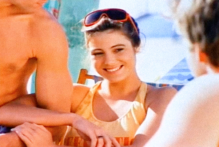
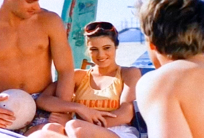
Donna Logan (Carrie Mitchum)
Donna returns to the beach.
The setting is the same. The framing is not. The camera moves closer, turning a cheerful group scene into a far more intimate portrait. The image radiates sunlight, warmth, and youthful optimism.
It has the effortless brightness of late-1980s lifestyle advertising, the kind of imagery that celebrated friendship, freedom, and California living.
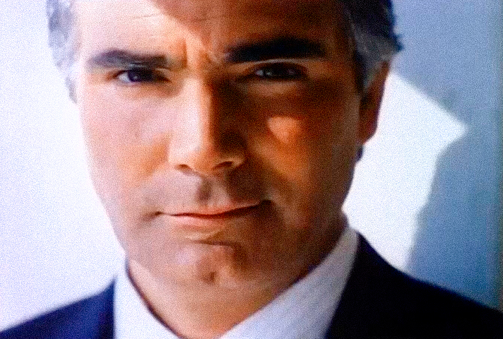
Eric Forrester (John McCook)
Eric appears again. Now almost everything has been stripped away. No skyscrapers. No office. No dramatic architecture. No symbolic composition. Only his face remains. Nothing distracts from it. At this point, Fitzgerald no longer relies on visual metaphor. He relies on presence.
The portrait works because John McCook’s screen presence is powerful enough to carry the frame entirely on its own.
Sometimes the strongest image is also the simplest.
Frames 43-45 - Constructing Beauty
Constructing Beauty
The opening sequence briefly returns to the world of fashion. Not through finished garments. But through the process of creating them.
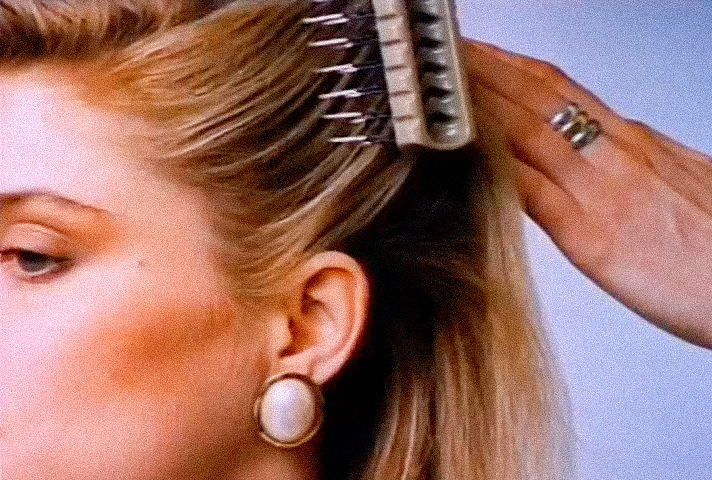
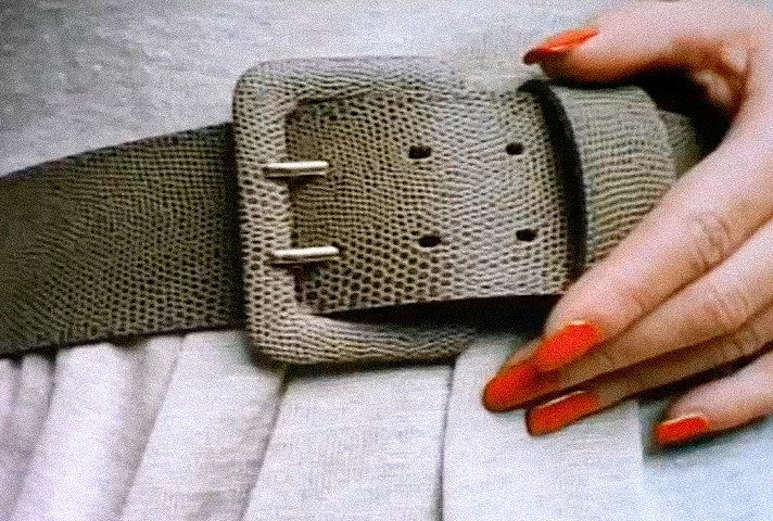
A stylist brushes a model’s hair. A hand fastens a wide leather belt. A glimpse of delicate lingerie appears before disappearing again.
These are not portraits. They are fragments. And that is precisely the point. Fitzgerald approaches the human figure much as a fashion designer approaches a couture gown. Not as a finished object. But as a composition assembled piece by piece.
Hair. Fabric. Accessories. Texture. Gesture. Each element contributes to the final image.
This approach strongly recalls the visual aesthetics that defined much of the late 1970s and 1980s.
The celebrated illustrator Patrick Nagel, for example, rarely pursued photographic realism. Instead, he isolated a handful of defining features: the curve of a neck, the contour of a mouth, the sweep of a hairstyle, or the play of shadow across a face. The viewer’s imagination completed everything else.
That is not to suggest Fitzgerald was consciously referencing Nagel.
Rather, both artists seem to belong to the same visual culture, one in which a carefully chosen detail could express beauty more powerfully than a complete portrait ever could.
Frames 46-47 - Beth Returns
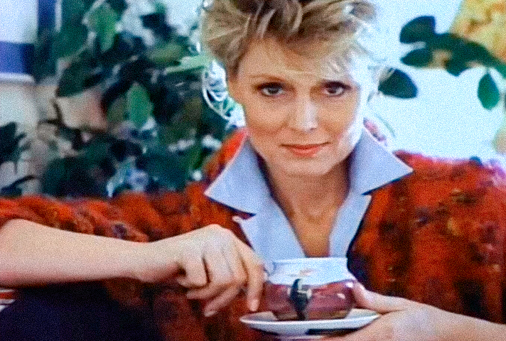
Beth Logan (Judith Baldwin)
And once again, Fitzgerald surrounds her with the quiet language of home. Family photographs rest on the table beside her. A cup of tea sits comfortably in her hands. Warm light fills the room. Every detail reinforces the same impression.
This is not simply a woman. This is a mother. The emotional center of the Logan family.
Her home feels lived in rather than displayed. Unlike the carefully composed elegance of the Forrester mansion, Beth’s surroundings speak of warmth, memory, and everyday family life.
The family photographs are particularly revealing. Without drawing attention to themselves, they quietly suggest that the people around Beth matter more than the house itself.
Frames 48-49 - Return to Ridge
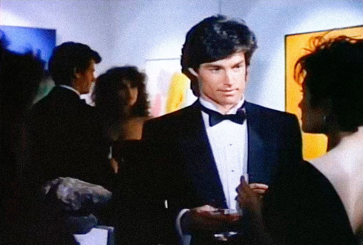
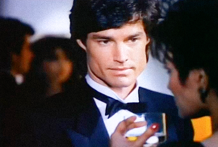
Ridge Forrester (Ronn Moss)
The opening sequence shifts once again. We return to Ridge.
This time, however, Fitzgerald reveals the world surrounding him. What had previously appeared to be an isolated portrait now becomes part of a larger scene. Ridge is attending what appears to be an art gallery opening or a fashionable exhibition.
The setting is significant.
Fitzgerald does not associate Ridge solely with the fashion industry. He places him within a broader world of art, culture, and creative sophistication.
Fashion, after all, does not exist in isolation. It has always been part of a larger artistic conversation. Ridge belongs naturally within that world.
The second shot moves closer. Ridge is engaged in conversation with an elegantly dressed woman, a drink in her hand. Nothing dramatic happens. Nothing needs to. The image quietly completes the portrait Fitzgerald has been constructing from the beginning of the sequence.
Ridge is wealthy. Confident. Talented. Charismatic.
Entirely at ease in the sophisticated social circles he inhabits. Without saying a word, the audience understands exactly who he is.
Frames 50-52 - Beauty Beyond the Runway
Beauty Beyond the Runway
The opening sequence returns once again to the world of fashion. But Fitzgerald now creates one of his most elegant visual transitions.
A fashion model. Caroline Spencer. Another fashion model.
The rhythm is deliberate.
Caroline is framed between these two images of professional beauty, quietly blurring the line between the glamorous world of fashion and the world of the series itself.
Caroline feels less like a fictional character and more like someone who naturally belongs in that world.
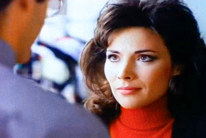
She does not imitate glamour. She embodies it.
Frames 53-54 - Stephanie Forrester
Stephanie Forrester (Susan Flannery)
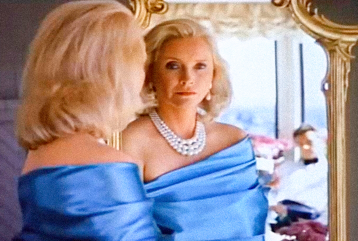
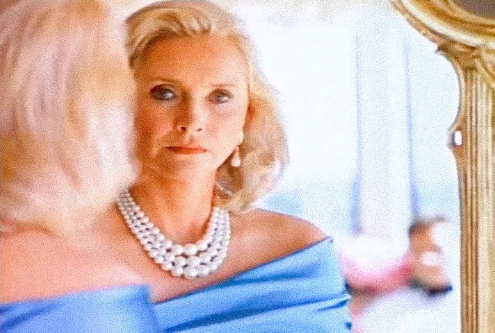
These may be the most iconic images in the entire opening sequence. Images that reveal more with every viewing. Stephanie stands before a mirror.
The woman and her reflection. A brilliant visual choice.
Wrapped in a flowing blue silk sheet and wearing an elegant pearl necklace, Stephanie appears both intimate and regal.
The image feels deeply personal. Yet never provocative.
Why?
Because our attention is immediately drawn away from her and toward the mirror.
That is where the real cinema begins. We see Stephanie. We see her reflection. And then… Almost hidden in the background…
We notice a man. His presence is so understated that he almost disappears into the composition. His identity remains uncertain. And that uncertainty is precisely what gives the image its power. The shot quietly reminds us that behind the formidable matriarch exists another woman, one whose private life remains just beyond the audience’s reach.
It is one of the most elegant moments in the entire opening sequence.
Frame 55 - Eric Forrester
Eric Forrester (John McCook)
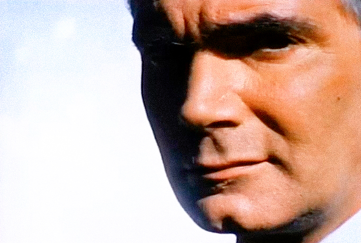
Immediately after Stephanie’s intimate portrait, Fitzgerald cuts to Eric.
Alone. Separated not only from Stephanie, but from everything around him. Only half of his face is visible. Harsh California sunlight carves deep shadows across his features. The background is almost entirely empty. Nothing distracts the eye. The simplicity of the composition gives the portrait extraordinary power.
After the emotional complexity of Stephanie’s previous shot, Eric’s image feels reserved, almost impenetrable. It is another reminder that Fitzgerald never presents his characters as entirely knowable.
There is always something left unseen.
Frame 56 - The Skyline
The Skyline
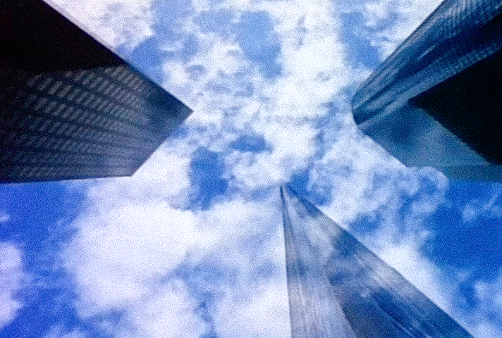
The penultimate shot returns to the Los Angeles skyline. The camera looks upward. The skyscrapers seem to stretch endlessly into the sky, drawing the viewer’s eye toward a single point high above. It is a fitting image with which to close the sequence.
Whether it represents ambition, success, destiny, or simply the endless pursuit of dreams is left for the viewer to decide. What is unmistakable, however, is the sense of aspiration.
Every character introduced in the opening sequence is striving toward something. Each follows a different path. Each pursues a different dream. Yet they all share one defining quality.
They are The Bold. They are The Beautiful.
Frame 57 - The Final Title
The Final Title
And here, Fitzgerald places the final full stop. The series title appears one last time. But not against a plain background. Not against an abstract color. It rests upon rolls of fabric.
The sequence has come full circle.
It began with a camera. Studio lights. Fabric. The creative process. And it ends exactly where it began.
Everything starts here.
With fabric. With an idea. With the workshop. Not only in the literal sense, but in the creative one.
Every act of creation begins with a blank canvas. For a fashion designer, it may be a roll of cloth. For an artist, an empty sheet of paper. For the characters we are about to meet, it is life itself, still waiting to be shaped.
And with that final image, Wayne Fitzgerald quietly reminds us that every great story begins with an act of creation.
Nearly forty years later, audiences still remember this opening sequence. Not because it was expensive. Not because it was technically groundbreaking. But because Wayne Fitzgerald understood something timeless: an opening sequence should not simply introduce a television series. It should invite the audience into its world. Frame by frame, he did exactly that.
Watch the Original 1987 Opening
Now that we have explored Wayne Fitzgerald’s opening sequence frame by frame, watch it once again as it was meant to be seen: in motion, with Jack Allocco and David Kurtz’s iconic theme bringing the images together.
Some opening sequences introduce characters. Wayne Fitzgerald introduced a world.
The world of The Bold and the Beautiful.