The Art of the Original Opening Sequence
How Wayne Fitzgerald Introduced The Bold and the Beautiful to the World
Everything begins somewhere. In television, few elements are more important than an opening sequence. It is the audience’s first impression, setting the mood, defining the visual identity, and inviting viewers into a new world.
The original opening sequence of The Bold and the Beautiful ultimately became every bit as bold, elegant, and luxurious as the series itself. In this article, we’ll explore what made it so different from most television openings of its era and why it has earned its place as a true classic.
Surprisingly, the story begins almost a century earlier.
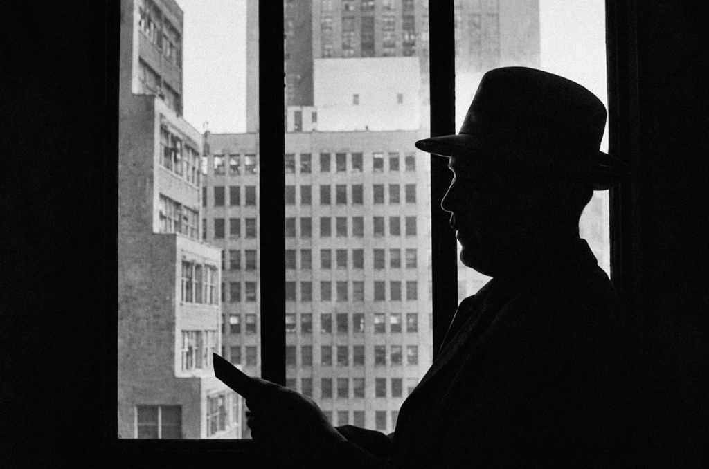
Walter Huxley (1926)
In the early 1930s, designer Walter Huxley created a typeface called Huxley Vertical (later released in various digital versions as Huxley Vertical BT Regular or Huxley Light Condensed). It was an exceptionally refined geometric sans serif that perfectly embodied the streamlined Art Deco aesthetic of its time.
Huxley was one of the principals of Huxley House, a Manhattan-based design and printing firm. He developed the typeface for American Type Founders (ATF), which officially released it in 1935.
Huxley Vertical reflected the growing fascination with streamlined Art Deco design that defined the 1930s. The style dominated architecture, advertising, transportation, and industrial design throughout the decade. It reached its peak at the 1939 New York World’s Fair, where more than 30,000 visitors each day experienced Futurama, the famous exhibition that envisioned a sleek, streamlined future.
Inspired by this design movement, Huxley created a typeface unlike anything else available at the time. Yet despite its originality, it failed to find commercial success. Sales were so disappointing that ATF did not even include it in the company’s type catalogs during the 1940s.
At the time, American Type Founders was the dominant force in American typography and type manufacturing. Throughout the late nineteenth and first half of the twentieth century, its influence on graphic design was enormous. If ATF considered a typeface unsuccessful, its chances of finding a wider audience were extremely slim.
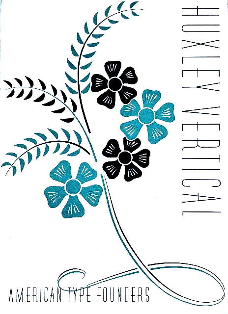
Huxley Vertical AD Poster (1935, ATF)
Following Walter Huxley’s death, ATF made one final attempt to revive the typeface in 1955.
Unfortunately, the effort was surprisingly uninspired.
The company barely explained or demonstrated the alternate letterforms that had been one of Huxley’s most distinctive ideas. Instead, Huxley Vertical was marketed alongside the streamlined industrial styling that had become fashionable in American consumer products of the 1950s, particularly kitchen appliances.
The campaign failed to generate much interest, and once again the typeface disappeared into obscurity.
For the next thirty years, Huxley Vertical was largely forgotten.
More than fifty years later, the forgotten typeface finally found the role it had been waiting for.
In 1987, William J. Bell set out to create a new CBS daytime drama centered on wealth, power, ambition, romance, and the glamorous world of high fashion. The series would become The Bold and the Beautiful. To design its opening titles, Bell turned to one of the industry’s true masters: Wayne Fitzgerald.
You’re only seeing the beginning.
The real story – the risks, the decisions, and the people behind the phenomenon – is waiting inside the full article.
🔒 Exclusive content for B&B Forever members.